Wednesday, 16 May 2012

Final Animation College Assesment

Some time ago I blogged about the final animation I was working on, and at the time we had only just been given the assignment so I did completely forget about it until the graded unit exam was over. It is now, so unfortunately having to start back on probably my least favourite part of the whole course. 

Funny isn't it, I thought I would love creating animations but to be honest, I find I am probably that bit better at SQL code. Code in general is pretty hard but the more you learn the easier it gets and now I have no problem reading a line of this stuff and understanding it! Which is cool for me, but probably a tad bit geeky! 

Anyhooha, my animation.....

IS GOING TO BE.. based on pikachu (p.s the links an easy way to draw him!) YAY! >.<

Drum roll.... 

Well first of I should probably state what the animation must include, and by the way this thing is no where near ready, I was just hoping to hear what people think about it?

So it must include;

produce a description of the animated sequence
produce a series of storyboards for an animated sequence
produce a 15 second animation produce and modify at lease three vector graphics
use at least one non-vector graphic
include at least five layers
include at least two scenes
apply frame-by-frame animation techniques
apply motion tweening techniques
apply shape tweening techniques
add and animate an object along an animation path
add at least one sound file
save the final project in the format specified in the given brief

And HERE is what I have!

My Animation Video


I am hoping I can pass this unit eventually but as I may have mentioned I am prego and 17 weeks now and to be honest I want to get out there and work now to save some money for the wee one coming, of course I will carry on with it though cos this baby's mummy isn't a dropout!

Brigid Visser
 
Professional, creative, media design from CR8:V-Design.
Facebook Twitter Blogger YouTube pinterest
Contact me: Skype brigid.visser

Tuesday, 15 May 2012

Change Of Plan

College finishes up next month guys. I'm already 17 weeks prego so by then will be around 22 weeks gone and there will be no hiding this baby. It's been totally worrying me non-stop as to what to do and the hormones especially were not helping.

But now I think I have the beginning of a plan. I will try to find some agency design work, once I have completed a website re-design I planned to do from the beginning of July. Then I will work until Mid-September if I can or if baby decides not to come along any earlier.

At least with my qualification I will be able to work from home now and when baby comes. I have a feeling I will miss having colleagues and working in an office, the daily getting up, dressing nice, the journey in. Ahh well.

If any creative minds are in the same place as me get in touch, as I could definitely use the company (even if its only through Skype) in the future.

Ohh the most exciting part! I am going to decorate! I am going to do our bedroom, where baby will be living for a long time, and our living room! Picked out the most gorgeous wallpaper to do a feature wall for above my fireplace! man its so exciting to be planning something like this, and do it while I'm still able to get on a ladder.

Oooh! Jeez this really is prego brain fogi to the max! My poor partner Martin is being made redundant next month as well, so we plan to take a weeks holiday to Ireland before he (hopefully) begins a new position. We both need some time together, to stop worrying about money and what we are going to do, our lives are in major, major upheaval and I (although I usually say we) have been really emotional.

Positive thoughts for the future now though because it is on!

Brigid Visser
 
Professional, creative, media design from CR8:V-Design.
Facebook Twitter Blogger YouTube pinterest
Contact me: Skype brigid.visser


Thursday, 10 May 2012

DIY Homemade Candles

Before I became pregnant and the smell became far too strong for me, I loved making candles.

I always seem to have scented candles burning and it seemed a waste of money to continually buy them in the shops when I knew I could make something just as nice on my own. I had always loved messing about with candles as a kid and found touching wax and the smells really relaxing and therapeutic so I was looking forward to looking into this hobby and see if I was any good at it.

I initially began by buying a Candle Making Starter Kit from Amazon.You can buy this for £10.14 currently with free delivery.

I also bought soap making kit at the same time but I didn't find this as much fun to do.

early candles
Early Candles
As I began making candles they started off small, and admittedly not very good! My ideas of adding things like dried lavender and my colour mixing skills weren't the best ideas but I was not disheartened easily. It was such a fun craft to do.
early candles
Early Candles
But as my interest and love increased, I began experimenting more and more, and spent so much money on different scents and colours from 4candles.net and really enjoyed sharing them with friends and family.

St. Patrick's Day Candle
Above, is another early example of a candle I made for my Mum for St. Patricks Day 2011.

Lavender Scented Candle
Cupcake Candle
Cupcake Candle


Amazon must have realised I enjoyed this candle making craft, and I received an email about the Cupcake Candle making kit above!

I realised I could make Icecream Sundae Candles with this method too, so I went out and bought this lovely Iced Cream dish just like what you would get in an ice cream parlour. I think the end result was pretty convincing! It certainly smelled delicious!


Strawberry Sundae Candle
I bought more, and more jars, various scents and colours all from 4candles.co.uk.
I had soon spent hundreds of pounds on my hobby but there was no stopping me. You can even recycle all of your old candles and bits of wax by melting it down again to reuse, (making sure to melt similar coloured wax together otherwise you end up with a poo colour.)

tiny candle in a jar
Tiny Candle In a Jar

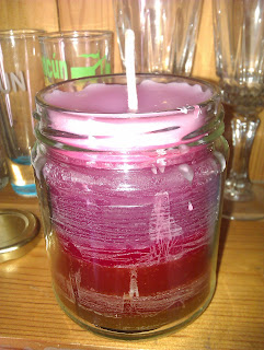
Bubblegum Scented Candle In a jar
Bubblegum Scented Candle In a Jar
When I started running out of candle holders I began filling old jars that would have been recycled anyway. I had to start asking friends and family to keep jars for me so I could fill them up too!
Bubblegum scented
Bubblegum Scented
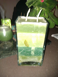
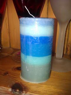
Seabreeze Layered Candle
Freshly Cut Grass Scented Candle


Baby Powder Scented Candle
My partners Nana gave me this jar which has a beautiful butterfly on it! I loved it and saw a new purpose for it - It had to have a candle in there!

Various Candles - Shot Glass Moulds
I found so many types of moulds to use when making candles. The above is a perfect example using an old shot glass, piercing a hole in the top for the wick to come through and voila! Once the wick is through use blue tack to stop wax spilling out the wick hole and fill your mould as normal with the candle wax.
Various Candles made from an old M&s dish!
Jelly Candle In a Martini Glass
I bought some jelly candle wax, and I had wanted to make a funky Martini Gel Candle. I bough this from Amazon again! But the gel has to be melted at really hot temperatures so it wasn't the easiest to work with.

Penis Bubblegum scented candle
Last but not least I got a penis shaped ice cube tray from my friend who had bought it originally from Ann Summers and didn't think it was appropriate to use at home as she had a young daughter. I simply put the two sides of the candles together with the wick in the centre and melted it together. The results were so good I had an Ann Summers Party rep get in touch to ask me to make more to sell to her, unfortunately the cost of making it at home didn't make it a viable opportunity to sell on.

I hope this has inspired some of you to do the same. I will get back to candle making when the smell of the scents doesnt make me so lightheaded  in the future, I promise!


Monday, 7 May 2012

Colour In Interface Design


I recently posted about the Perception Of Colour and why people view colour so differently.

I'm a bit obsessed by colour and the effects it can produce in viewers. Colours used together can create strong emotions in the user. 

From The Little Book Of Calm - ♥ Visualise a sunset. Even though sunsets may sometimes be sad, they are always peaceful. And pink ones are even more peaceful. ♥

https://www.facebook.com/errigal.hostel
 

Now comes to why this is important when designing a user interface. Why should you bother worrying about colours your users will see when all you want is to use the colours you love? What if you want to use colours that clash like yellow and purple? How do you know what is going to cause perception problems?

Choosing how to design a user interface is a virtual minefield in design, you need to ask yourself first of all who your target audience is, then who the secondary audience will be?

These are questions you should be familiar with before you even begin exploring what colours your design should hold. Don't choose colours that you want to use, be aware of what effect this will have on the viewer and if there will be perception issues because of it. 

I read an interesting quote by Ira Glass about 'good work' - https://www.facebook.com/cr8vdesigns/posts/373592662676746

Colour Schemes 

Monochromatic


A single colour scheme is used in the monochromatic colour scheme, with variations in brightness and saturation. This  has a soothing effect on the viewer, because of the lack of contrast. This colour scheme creates a calming effect and is viewed as professional by the viewer.
Complementary
Colours adjacent to each other are the complementary colour.

The contrast in a complementary colour scheme creates a vibrant look especially when used at full saturation.

Complementary colour schemes are hard to use in large doses and cause perception issues when placed to close together, but work well when you want something to stand out.
Complementary colours are really bad for text as the colours appear to move because of the vibrancy of the hues used. 


Analogous
 
Colours that are next to each other are analogous. They usually match well and create serene and comfortable designs.

Analogous colour schemes are often found in nature and are harmonious and pleasing to the eye.

Choose one colour to dominate, a second to support and the third can be used as an accent.


Triadic
 
Colours that are evenly spaced around the colour wheel are triadic.
Triadic colour schemes tend to be quite vibrant, even when pale or unsaturated versions of the hue is used.

To use a triadic harmony successfully, the colours should be carefully balanced - allow one colour to dominate and use the two others for accent.

Split-Complementary


The split-complementary colour scheme is a variation of the complementary scheme. 
 As well as a base colour, it uses the two colours adjacent to its complement. 

This scheme has the same  contrast as in the complementary scheme, but has less tension.
This is a good colour scheme for beginners, because its hard to mess up.

Rectangle (tetradic)
This scheme uses  four colours arranged to two complementary pairs.

It is a rich colour scheme that has lots of choice for variety.
Tetradic colour schemes work well if you allow one colour to dominate

Pay attention to the balance between warm and cool colours you use in your design.

Square


This scheme is similar to the rectangle, but with four colours
evenly spaced around the colour wheel.

Square colour schemes work well if you allow one hue to dominate.
Again, pay attention to the balance between warm and cool colours in your design.

Get in touch if you have any questions at all and don't forget to take a look at my Pinterest account!

Brigid Visser
 
Professional, creative, media design from CR8:V-Design.
Facebook Twitter Blogger YouTube pinterest
Contact me: Skype brigid.visser